Putting those cookies to good use.
Because I love cookies. Some of my favorites here.
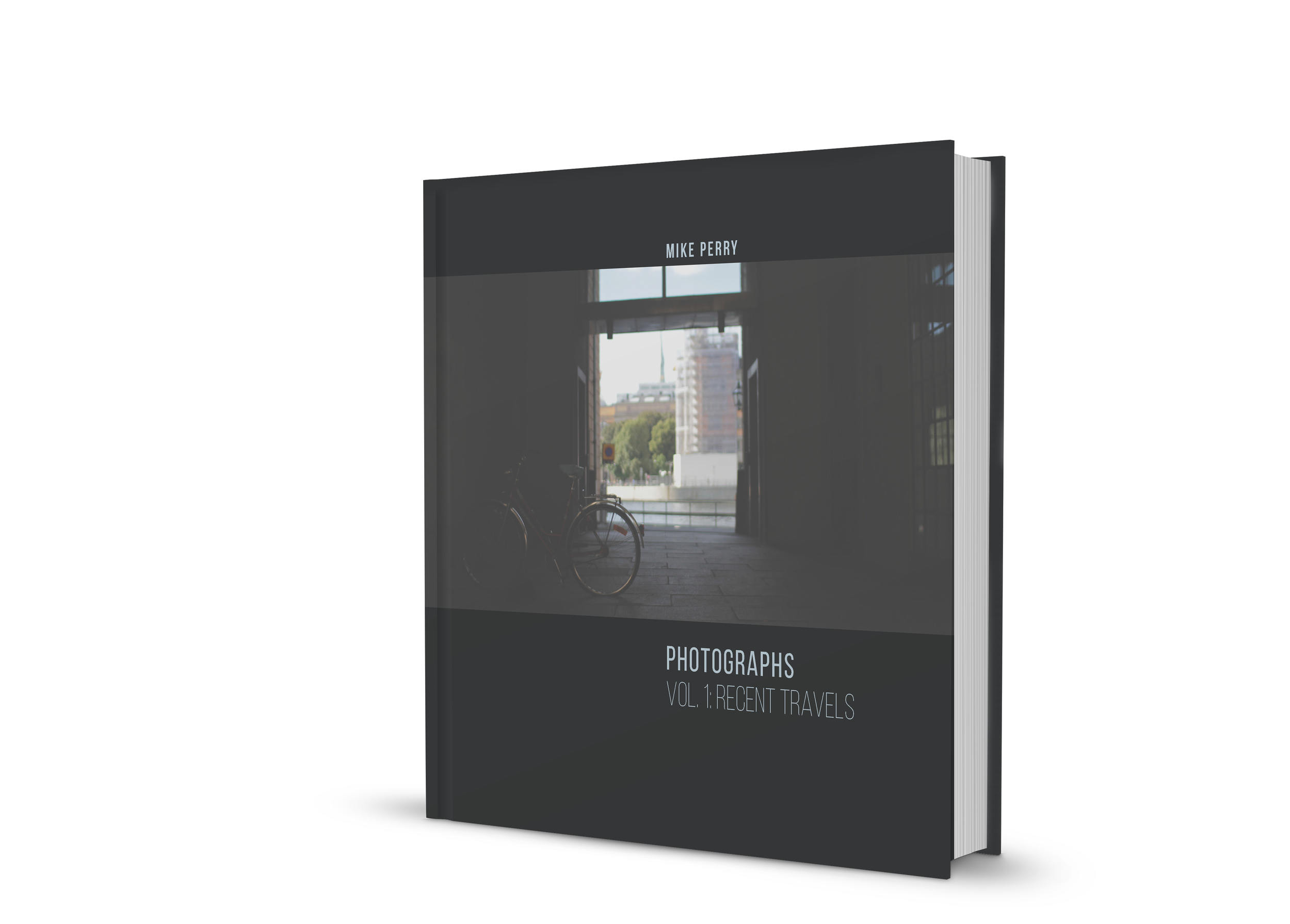
A couple of mockups.

Working on an icon set for a website. Please see the ILLUSTRATION tab for more in this set, and the VIDEO tab to see animated versions of icons from this set.
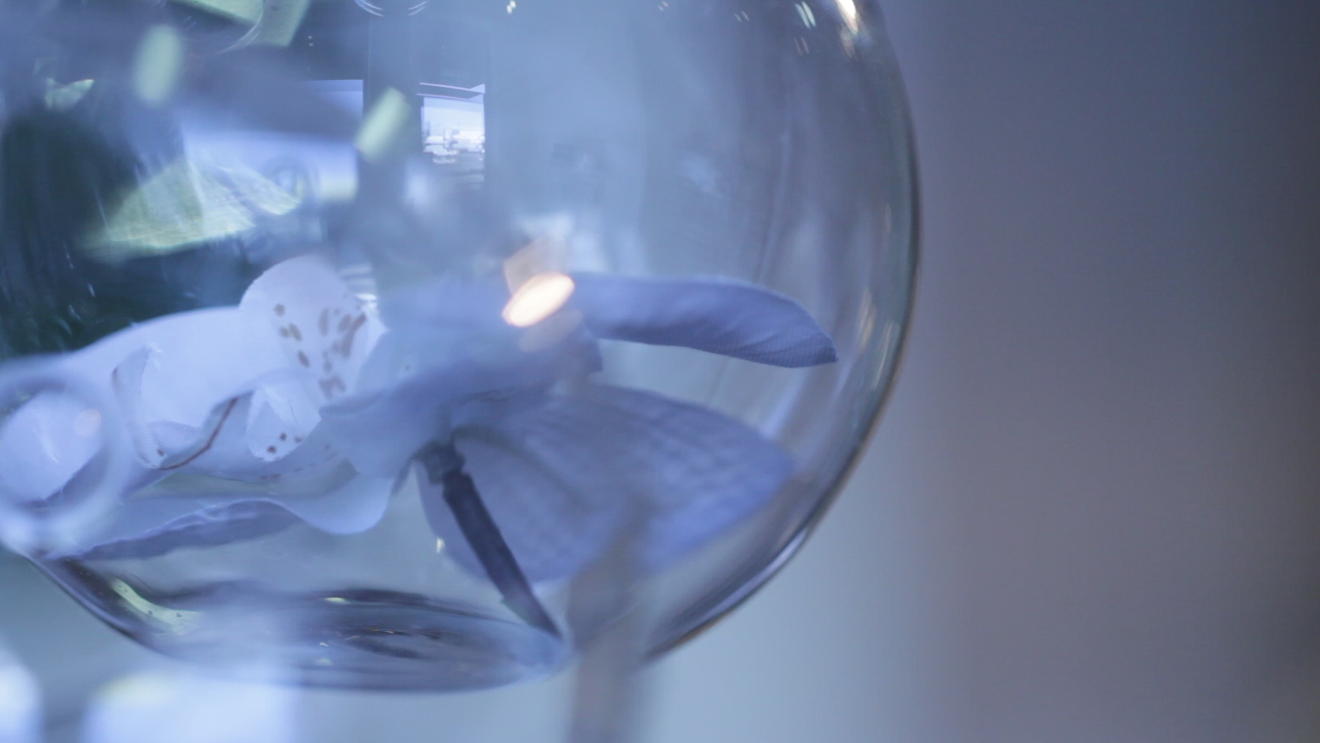
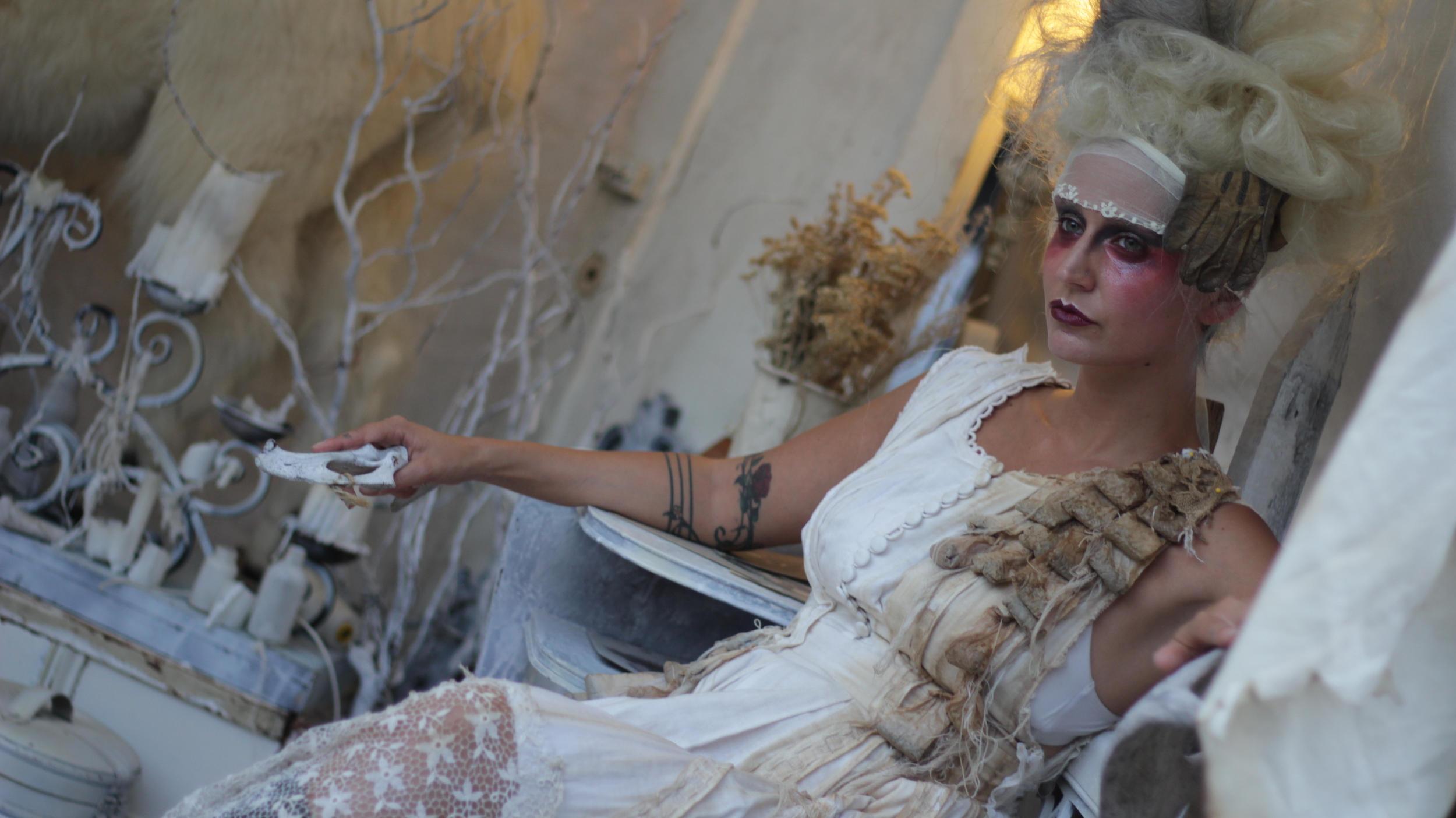
While the following images are video stills, the same retouching principles that work on photos work with videos. Video is somewhat more limited in what can be done as one is working with a series of moving images. My color treatment always has a purpose: to enhance the mood of the image, to better represent what the image felt like at the time it occurred so the viewer feels more than what the raw footage offers.

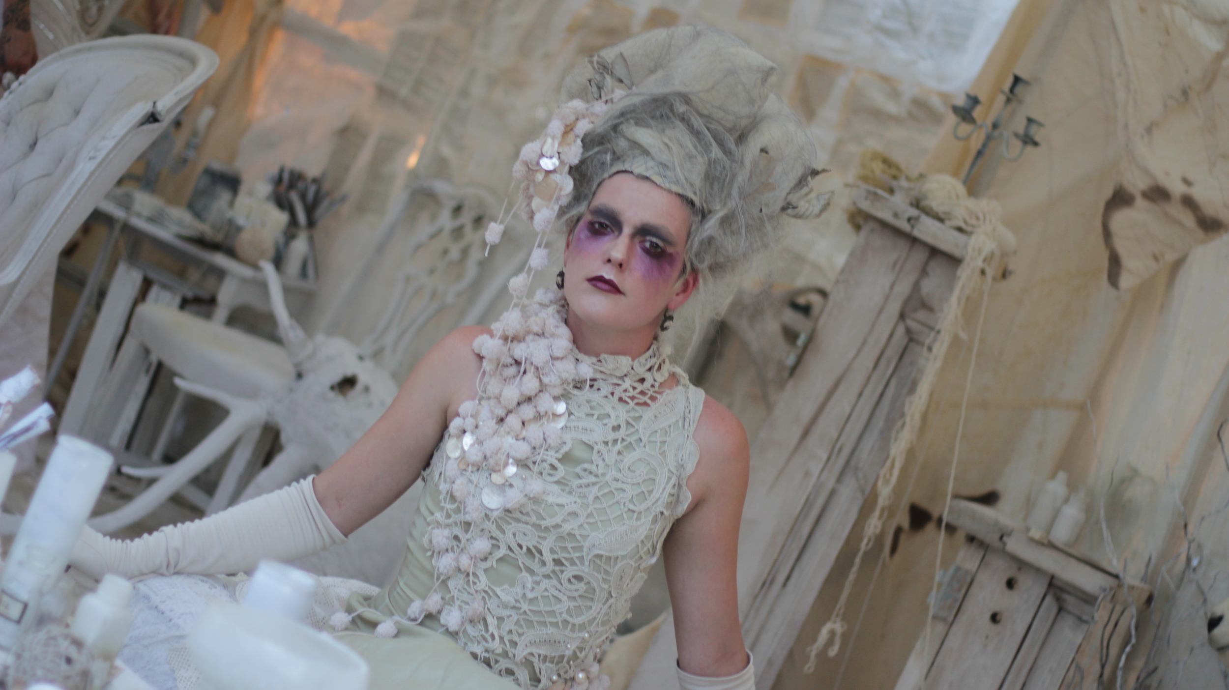
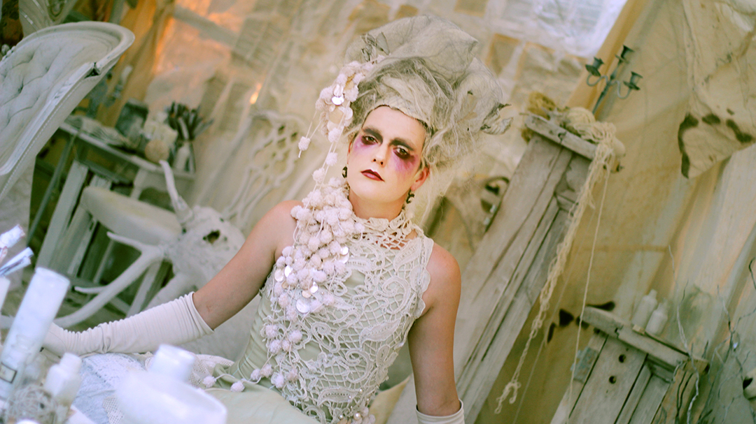
Before: a little dark and low contrast overall.

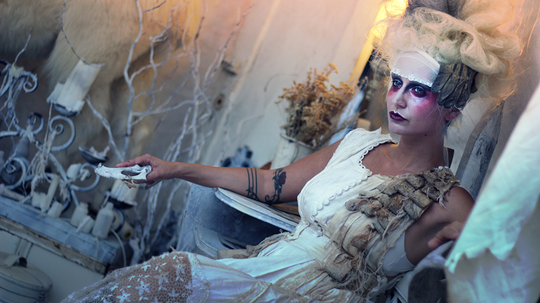
After: giving some warmth and light to the girl's face adds to the emotion of the scene. I also minimized the background contrast so that it would not compete with the main focus.
Before

After: creating some light, when done skillfully, can completely change the feel of the image.

Before

After: an edgy look to match the client's hip branding (green is their main color).
Raw photo and then after color grading in Photoshop.
Before, raw materials, and after. Color makes a big impact for a summer sale, which was the goal of these ads.


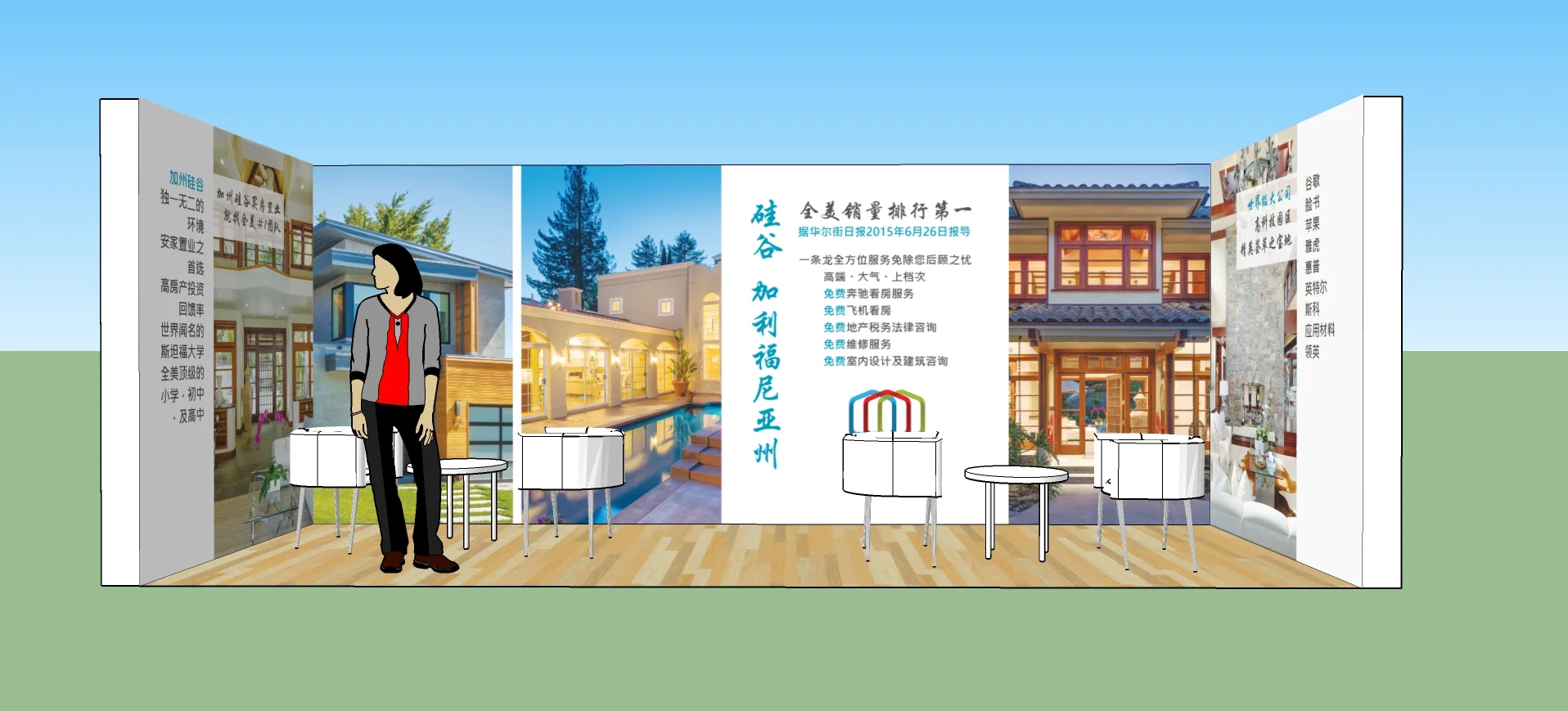
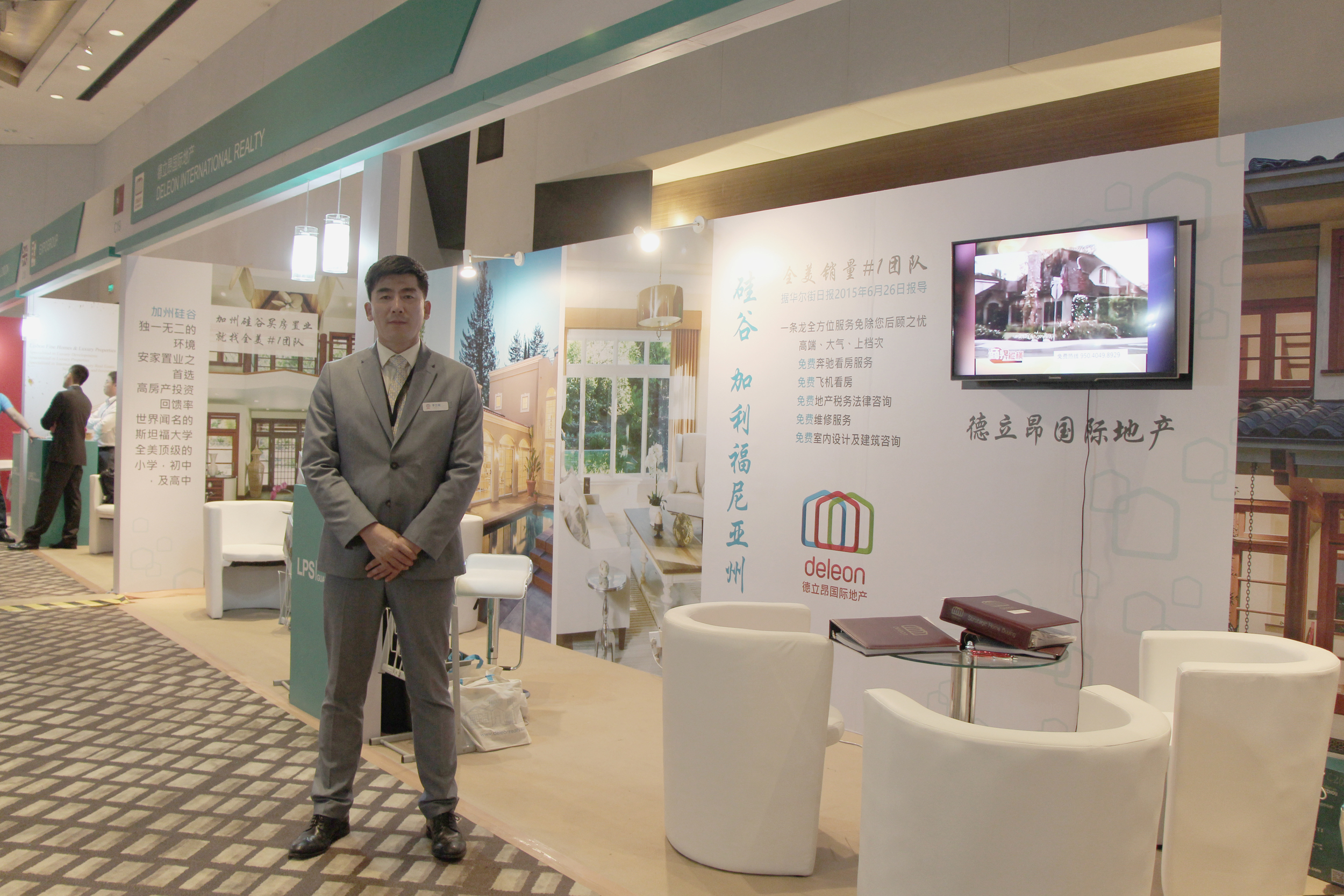
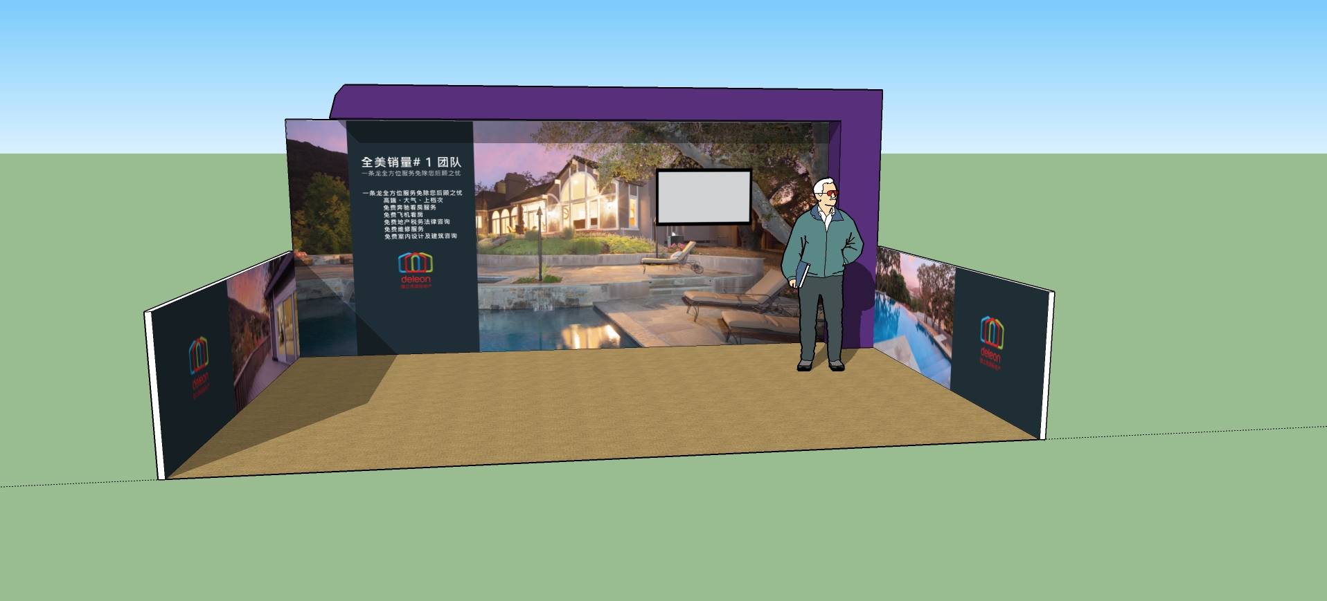
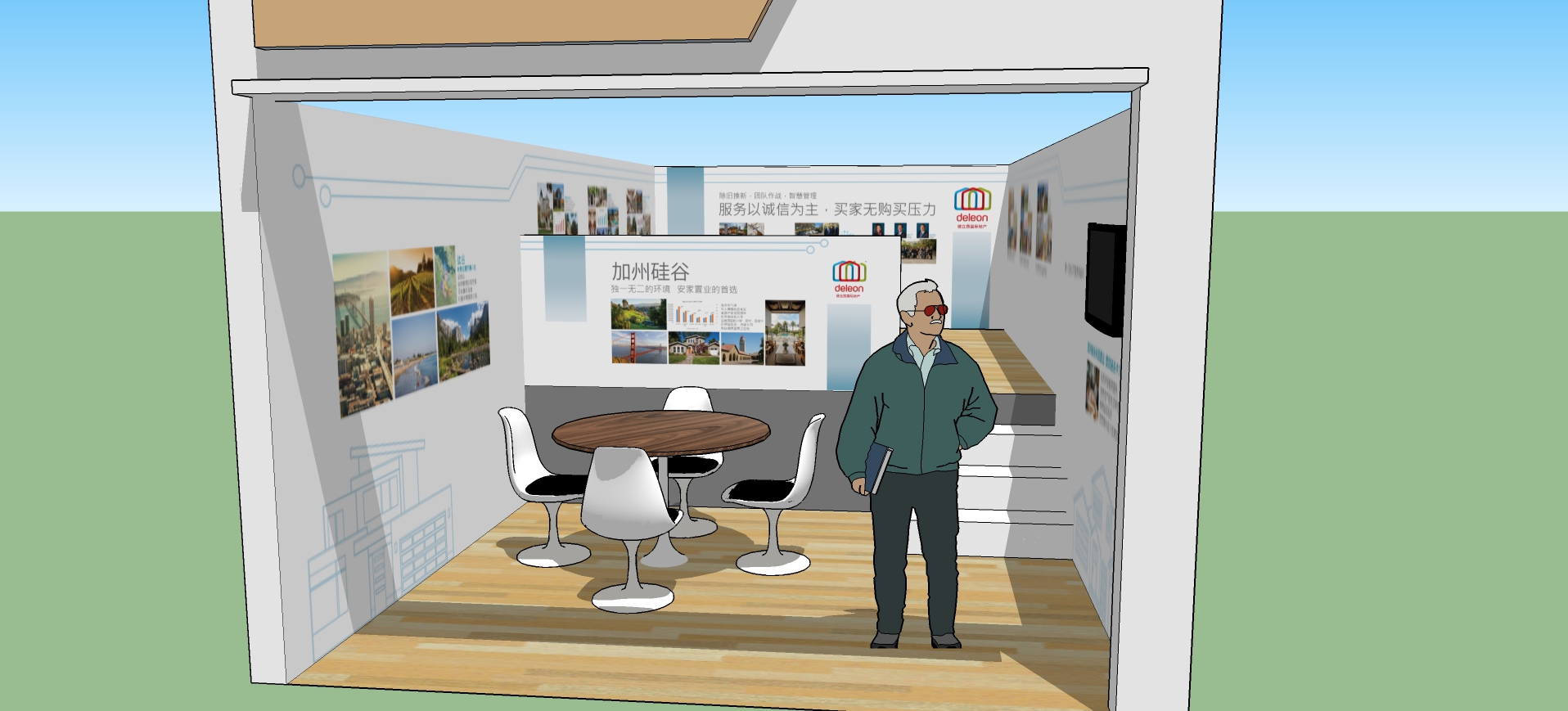
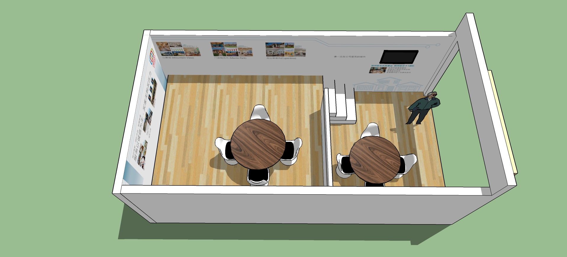
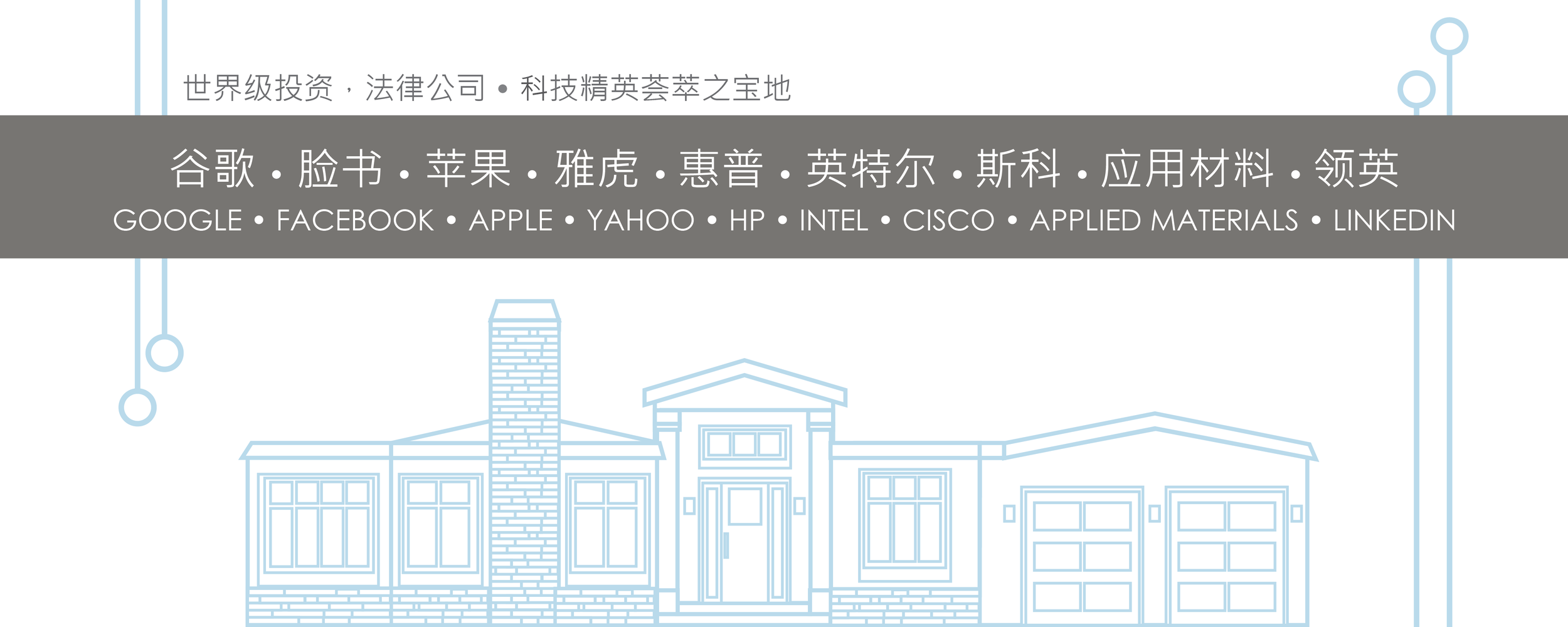
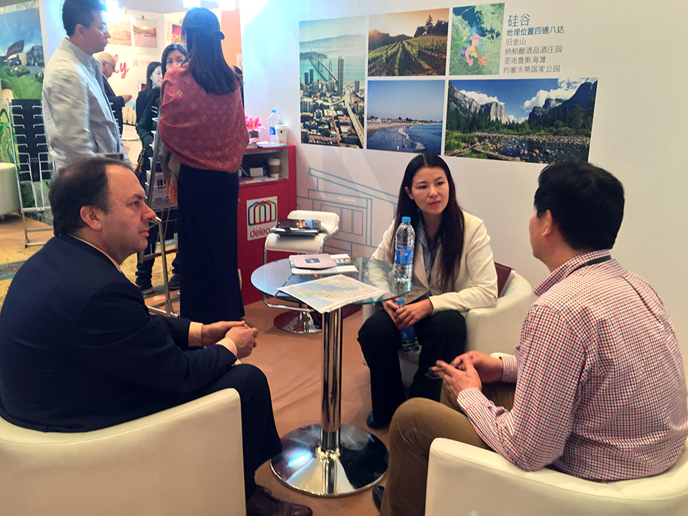
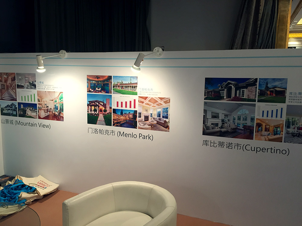
I designed trade show graphics for a few overseas real estate shows (Luxury Property Showcase). All shows were on mainland China in top cities, including Beijing and Shanghai.
Some logo explorations for an upcoming online magazine.

I wrapped a brown cardboard box with textured paper and added a white paper strip with a layer of decorative paper on top. A white ribbon ties it all together. The color is slightly more blue than Tiffany blue, and with white it feels festive and elegant.
Development on this logo continues. The straight legs of the M were not working. I took the W and flipped it for a more distinctive character. The scale of the logo in relation to the logotype also needed adjusting. Below are some experiments with using the logo shape with photos.
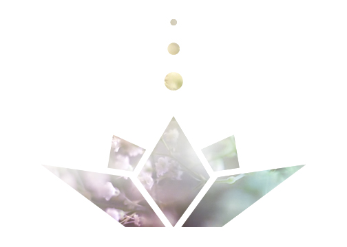

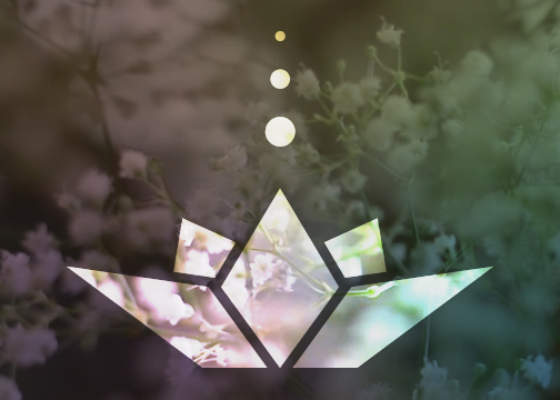
The process started with a discussion of what the audience should sense when seeing the logo, and how to combine that with the client's brand and values. Next, a flurry of pencil sketches to rough out an idea. Then when a solid direction was decided, on to Illustrator for clean rendering. One of the main decisions was how abstract to go with the lotus, and weighing the pros and cons of both. The color palette is still being explored.